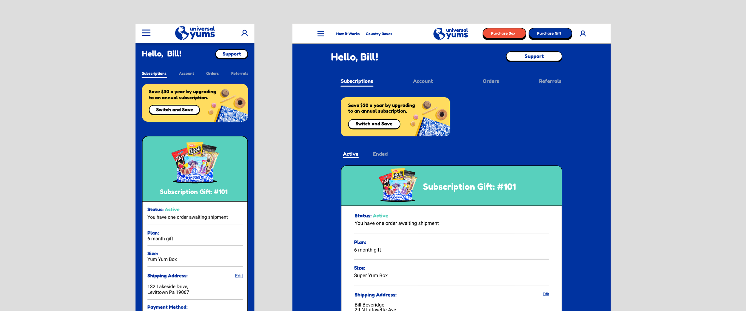
Making a Customer Dashboard That Makes Sense
Overview
Managing subscriptions alongside single sale purchases in the same dashboard could get a bit tricky for customers. For the customer that needs to cancel, they shouldn’t need to search through an endless sea of menus. Creating unique flows for each possible scenario and keeping a close relationship with the customer service department during the research, development, and follow up phases of the project ensured we were making meaningful improvements along the way.
Goals
To improve the overall user experience.
My Role
As the sole UI/UX designer for the project, I worked closely with the customer service and engineering teams. I was responsible for:
Suggesting changes that would streamline common use cases.
Wireframes / Prototyping / Hi-Fidelity UI design.
Outcomes
Customer service department noted less reported issues, better overall satisfaction with updating customer and order information through the dashboard.
Features Overview
-

Pop Up Modules
Alerted customers before they made any changes to their subscriptions or purchases, offering key information to aid in decision making.
-

Straightforward Cancellation
Made accesible with a followup survey to better understand and serve cutomers.
-

Branding touchpoints
Repurposing dead ends that could otherwise be frustrating into opportunities for customers to connect with our brand.
